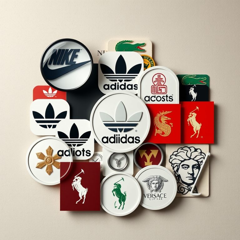
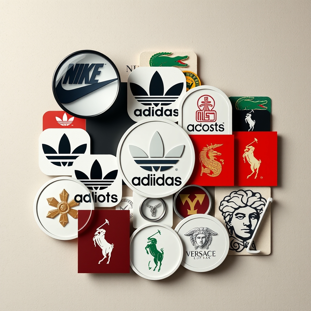
Logos and symbols are the silent ambassadors of apparel brands, conveying identity, values, and heritage in a single glance. Yet, their power extends beyond aesthetics—these emblems are meticulously designed to evoke emotions, trigger memories, and influence purchasing decisions. When dissecting the logo & symbol meaning behind iconic fashion labels, it becomes clear that every curve, color, and negative space is a calculated move to forge a deeper connection with consumers.
The Strategic Role of Logos in Apparel Branding
Apparel logos are not arbitrary; they are the result of extensive market research, cultural analysis, and psychological testing. Brands like Nike, Adidas, and Chanel leverage symbols to communicate their ethos without uttering a word. The Nike Swoosh, for instance, embodies motion and speed, aligning with the brand’s “Just Do It” ethos. Meanwhile, Adidas’ three stripes represent performance and versatility, a nod to the brand’s athletic roots.
These symbols transcend language barriers, making them universally recognizable. A study by the Journal of Consumer Research found that consumers form opinions about a brand within 10 seconds of seeing its logo. This underscores the importance of precision in design—every element must resonate with the target audience while differentiating the brand from competitors.
Color Psychology: The Unseen Influence
Color is one of the most potent tools in logo design, with each hue evoking distinct emotions. Red, for example, is often associated with energy and passion, which is why brands like Supreme and Coca-Cola use it to create urgency. In contrast, luxury brands like Tiffany & Co. employ robin’s egg blue to convey exclusivity and sophistication.
Apparel brands also use color to signal their market positioning. Fast-fashion labels like Zara and H&M favor bold, high-contrast palettes to attract attention, while heritage brands like Burberry opt for muted tones to emphasize timelessness. The choice of color is never accidental—it’s a deliberate strategy to align with consumer expectations and brand identity.
Symbolism in Apparel Logos: More Than Meets the Eye
Beyond color, the shapes and symbols in apparel logos carry deep meanings. The Lacoste crocodile, for instance, is not just a mascot—it represents the tenacity and competitive spirit of its founder, René Lacoste. Similarly, the interlocking C’s of Chanel symbolize Coco Chanel’s initials, but they also evoke the idea of interlocking relationships, reflecting the brand’s philosophy of timeless elegance.
Some brands use negative space to embed hidden messages. The FedEx logo, though not an apparel brand, is a masterclass in this technique, with an arrow formed between the “E” and “x” to symbolize speed and precision. In fashion, brands like Puma subtly incorporate animalistic traits into their logos to convey agility and power, reinforcing their athletic positioning.
Cultural and Historical Context in Logo Design
Logos often draw from cultural or historical references to establish credibility and heritage. The Ralph Lauren polo player, for example, evokes the aristocratic sport of polo, positioning the brand as a symbol of luxury and refinement. Similarly, the Versace Medusa head is inspired by Greek mythology, representing allure and irresistible charm.
These references are not merely decorative—they serve as storytelling devices. Consumers who recognize these symbols feel a sense of belonging to a narrative larger than the product itself. This emotional resonance is what transforms a logo from a mere graphic into a cultural icon.
The Evolution of Apparel Logos: Adapting to Modern Trends
As consumer preferences shift, so do logos. Many brands have simplified their emblems to align with digital trends, where minimalism ensures clarity across screens of all sizes. The Levi’s batwing logo, for instance, has undergone subtle refinements over the decades to maintain its relevance while preserving its heritage.
However, not all changes are well-received. Gap’s 2010 logo redesign was met with backlash, forcing the brand to revert to its original emblem. This highlights the delicate balance between innovation and tradition—consumers often resist drastic changes to symbols they’ve grown attached to.
Why Some Logos Stand the Test of Time
The most enduring logos share a few key traits: simplicity, memorability, and adaptability. The Lacoste crocodile, the Nike Swoosh, and the Adidas trefoil have remained largely unchanged because they are instantly recognizable and versatile. These logos work equally well on a billboard, a product tag, or a social media profile, proving that timeless design is scalable.
Another factor is consistency. Brands that maintain a cohesive visual identity across decades—like Hermès with its horse-drawn carriage—reinforce their legacy. This consistency builds trust, as consumers associate the logo with reliability and quality.
Decoding the Hidden Messages in Your Favorite Brands
Next time you see an apparel logo, look beyond its surface. The logo & symbol meaning often reveals the brand’s values, history, and aspirations. The Amazon smile, for example, not only represents a happy customer but also subtly points from “A” to “Z,” symbolizing the brand’s vast product range. Similarly, the Under Armour logo’s interlocking “U” and “A” form a shield, reinforcing the brand’s protective and performance-driven ethos.
Understanding these nuances allows consumers to make more informed choices, aligning their purchases with brands that resonate with their personal values. For designers and marketers, it’s a reminder that a logo is never just a logo—it’s a strategic asset that shapes perception and drives loyalty.
Whether you’re a brand strategist, a fashion enthusiast, or a curious consumer, dissecting these symbols offers a deeper appreciation for the thought behind the designs. The next time you spot a logo, ask yourself: What story is it telling? The answer might just change how you see the brand forever.
About the Author